Table of Contents
- 1. Take the time to welcome site visitors
- 2. Make the most of successful content and identify what’s not doing as well
- 3. Entice visitors with gated content
- 4. Optimize copy for organic search success
- 5. Make sure your website is mobile friendly
- 6. Include alt-text for all of your site’s images
- 7. Add a chat function to your site
- 8. Give CTAs a facelift and consider adding more
- 9. Create a sense of urgency
- In conclusion
Since your website is often the first touchpoint a potential client has with your company, you want to do everything you can to ensure that it yields real results from visitors.
There should be a clear path to follow and a set of actions to complete. Without a fine-tuned and efficient website, you’ll miss out on a pool of potential opportunities.
So, how does one fine-tune? With these nine quick but effective tweaks.
1. Take the time to welcome site visitors
Much like the lobby of a hotel or the entrance to your house, your homepage is where your website visitors will formulate their first impressions of your brand. What you present to them initially will help them make the quick decision to stay or leave.
Incorporating something like a pop-up that appears after several seconds and encourages visitors to share their email addresses in exchange for a welcome offer is a great way to start a relationship with your brand and gather potential leads.
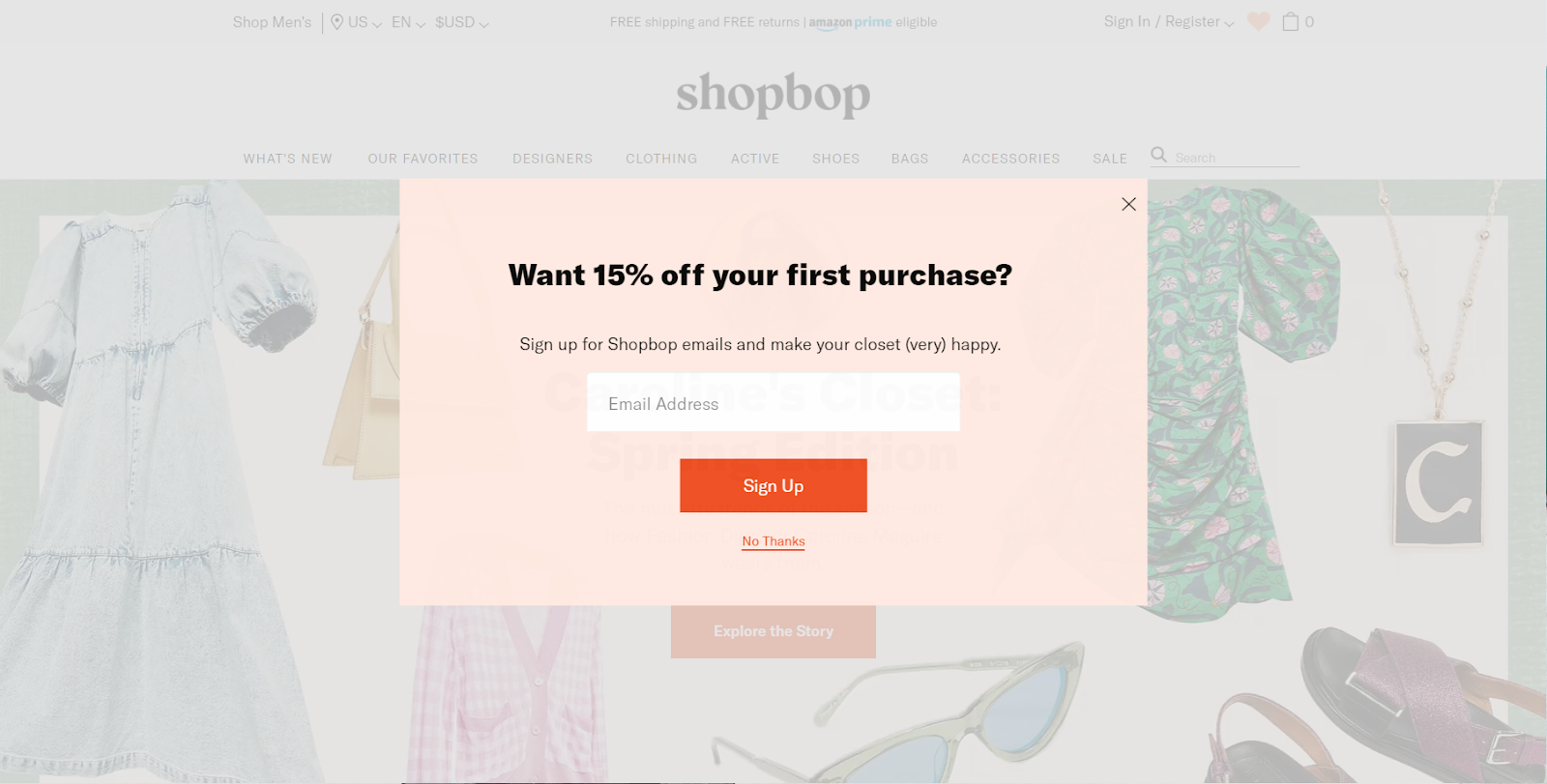
Regardless of whether they decide to stay on your site after that, you now have a new touchpoint to engage them with.
2. Make the most of successful content and identify what’s not doing as well
You should be reviewing analytics regularly to evaluate which pages on your website garner the most traffic and which forms generate the most conversions.
From here, you can inform all sorts of content decisions, such as adding more conversion opportunities to the successful pages, replicating elements of those successful pages when creating new ones, and even optimizing forms on other areas of your site to match the style of high-converting ones.
The metrics that can best inform these decisions are typically those pertaining to acquisition, behavior, and conversions, so specifically, number of users, bounce rate, average session duration, and goal completion location.
Similarly, Google Analytics reports such as Behavior Flow, Goal Flow, and Top Conversion Paths can help to illustrate where users dropped off prior to converting. A number of factors could be impacting this, such as page design, content, form questions, or call-to-action button appearance, but at least you can pinpoint the page potentially hindering conversions and use A/B testing to modify and ultimately improve results.
When it comes to A/B testing, keep in mind the No. 1 rule that only one element should be tested at a time. Otherwise, how else will you know what actually led to a change?
3. Entice visitors with gated content
If you want to turn your new site visitors into returning users, you need to find a way to get them committed to your brand.
Lead magnets, or gated content, can help with this. These are offerings, typically comprehensive content pieces or free trials, that help your visitors solve a specific problem.
They should be free, with the only access to pass through the “gate” being a submission of contact information. Once you secure a visitor’s email address, you’ll be able to start the lead nurturing process.
Your lead magnet should be unique, meaning it should provide original information, such as tips or statistics, that’s not widely available anywhere else.
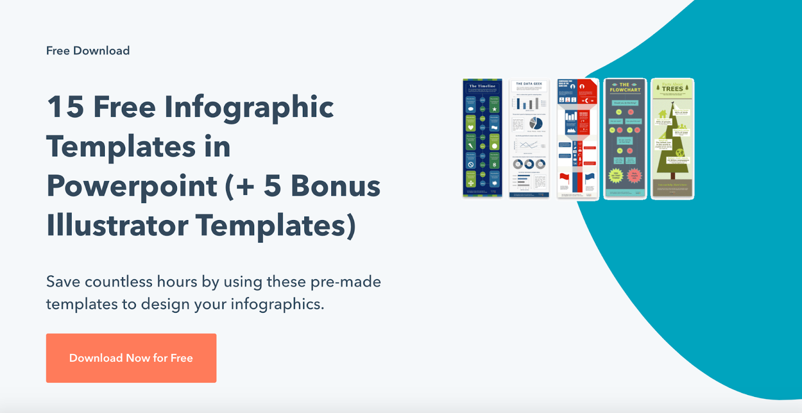
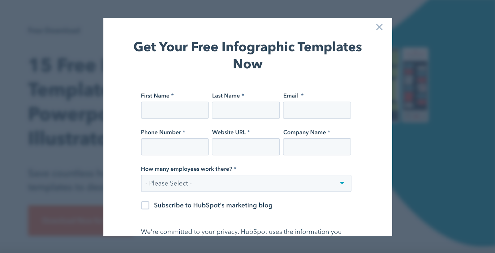
Your lead magnet could also be something like a quiz or survey that requires an email address to unlock results.
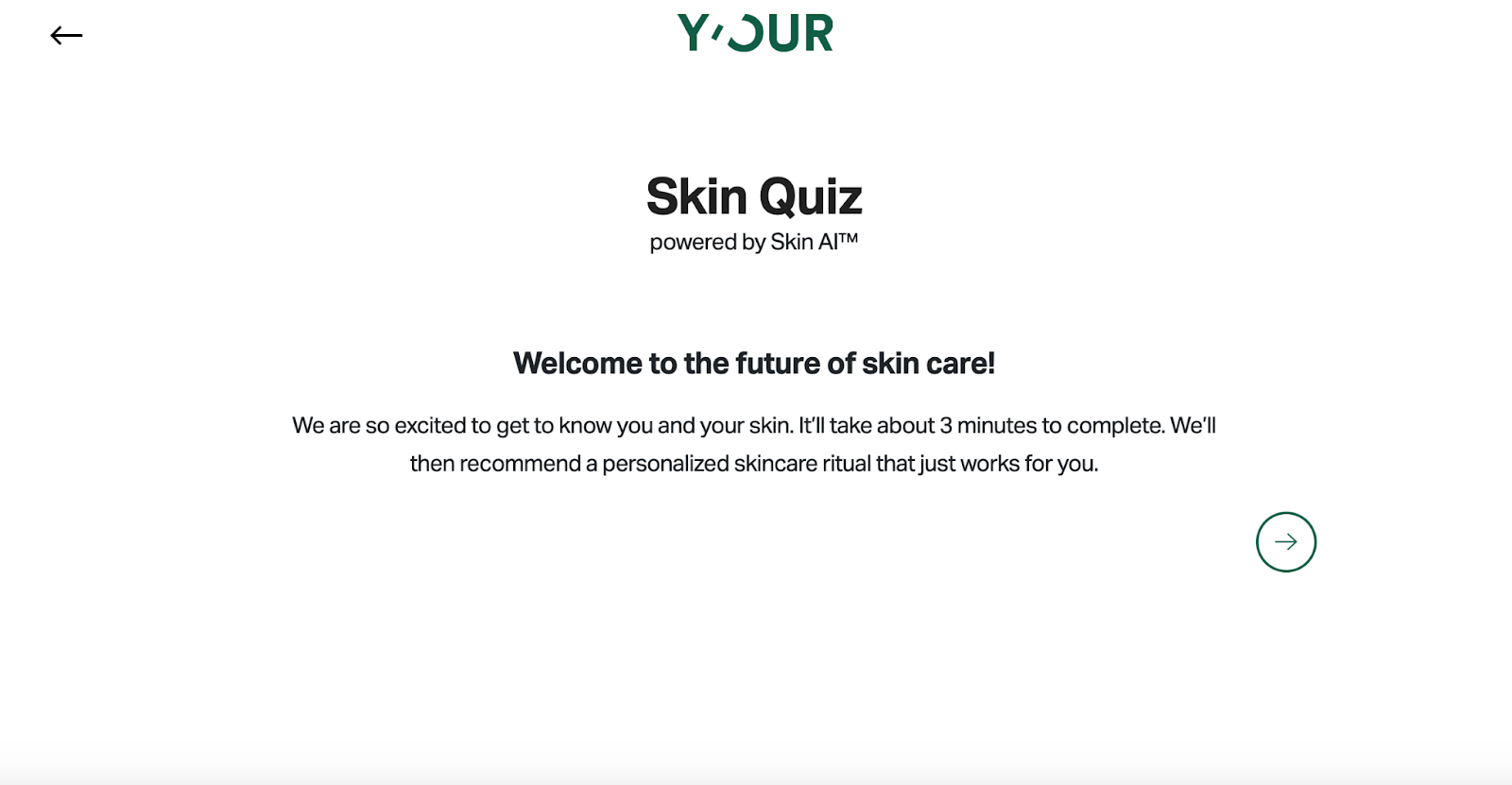
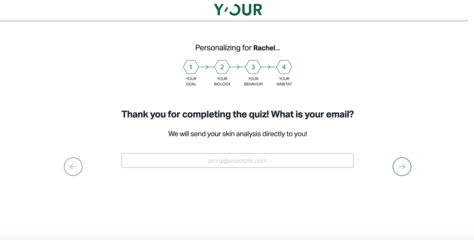
A bonus of using these types of interactive content is that you’re able to gather more personalized data from prospects and use that to your advantage when building focused audience segments for email marketing campaigns.
4. Optimize copy for organic search success
Conducting ongoing keyword research is a great way to constantly improve your website’s organic search performance and enhance your lead generation.
Google’s algorithm is big on matching users with content that best meets their search intents, so it’s important to know exactly what users search for in order to modify your site content.
If you’re finding that a blog about best Instagram practices generates a high volume of traffic but also has a high bounce rate and low average session time, it’s likely that this blog isn’t meeting user intents.
Upon further analysis, you find that the keywords generating traffic to this blog look more like “how to use Instagram” or “Instagram for dummies.” Naturally, your blog on Instagram best practices won’t be helpful to someone who doesn’t even know how to use the application. Thus, you can alter your blog copy to include tips for getting started with Instagram and some of the popular keywords pertaining to that topic. Or, you can use this insight to generate an entirely new blog that better caters to those search queries.
This same process applies to your website’s feature or product pages. It’s tempting to want to cast a broader net, but avoid being too general with keywords. The more well-researched and focused your keywords are, the longer users will stay on your page and the more qualified your leads will be. Google will also reward this behavior by moving your page up in its rankings.
5. Make sure your website is mobile friendly
Visitors will not want to spend much time on your website if it’s difficult to navigate via their mobile devices. And, since roughly 50% of global website traffic comes from mobile devices, that’s a lot of lost potential opportunities.
For this reason, having a responsive website is incredibly important. Most smartphone users won’t even attempt to navigate through a website that isn’t properly designed for mobile.
Why waste time on a clunky, slow site when it’s much easier to go back to the search results and get an answer from a competitor’s mobile friendly one, right?
s a brand with a website in such a digital-centric era, you should take the extra time to ensure your website is suitable for both desktop and mobile browsers. Doing so will only increase your chances of generating more leads.
6. Include alt-text for all of your site’s images
Adding image alt text, or the text that appears in place of an image in the case it doesn’t load, can help your website rank in Google Images, improve topical relevance so Google better understands what your content’s all about, and boost accessibility for those who are visually impaired and use screen readers to access content.
This simple tactic is so worth the additional time and effort it takes to execute, because it could ultimately help you generate more leads by reaching a wider audience.
Alt text can be directly added via HTML code, but luckily, most content management systems provide a field for the image file itself where you can include alt text.
When it comes to writing the actual text, there’s no need to include “image of” or “photo of,” nor should you include a bunch of keywords. Describe the image in as detailed yet concise a manner as possible.

7. Add a chat function to your site
Another way to engage with your site visitors and keep them on your website is to utilize a live chat feature.
Frequently enough, visitors search something general and end up on a website where they don’t know what to do next. They may get frustrated and leave instead of perusing what your website has to offer.
With a chat feature available, instead of leaving the site outright, they’re able to ask and receive guidance as to where they should navigate to find solutions to their problems. Anything that helps facilitate a smooth customer service experience will work in your favor, and with the proper assistance, this could mean new leads for your company.
It’s also worth mentioning that chat functionality has become pretty commonplace. Without it, you run the risk of visitors opting for a competitor with it.
8. Give CTAs a facelift and consider adding more
Call-to-action (CTA) buttons are the final step a visitor must take to become a lead. To encourage that step, your CTA button design should be eye-catching and its copy exciting.
Whether it’s on a landing page or in the middle of blog text, a CTA will be one of the first things a visitor sees at a glance. A best practice is to use bright colors, particularly greens and oranges, that contrast well with the button’s text.
For the text itself, phrases that are targeted towards your offer, such as “Download free guide” or “Start free trial now,” will be more likely to keep someone engaged with that content and eventually, generate a conversion, when compared to a simple “Get started.”
Lastly, when it comes to CTA button placement, the more the merrier. There should always be one on the screen so your visitors don’t have to scroll backwards or go out of their way to find one. You want to promote the smoothest user experience possible, and including a dynamic feature, such as a sticky header that contains a CTA, can help to achieve this.
9. Create a sense of urgency
While I’m sure we can all agree time-induced pressure is not ideal, the truth is that it’s effective. How many times has an “Only 1 left” prompt spurred you to make a purchase in much faster time than you normally would? Too often for me.
No one likes the feeling of missing out on a great opportunity or deal. Translating that feeling into your website’s messaging via time-sensitive language (“limited time only”) or countdowns (“offer lasts for just 24 hours”) boosts a sense of urgency and increases the chance that visitors take action.
In conclusion
While these are generally effective tips, every brand’s strategy will be different. It takes trial and error to find the best way(s) to enhance your website’s lead generation capacity.
Nonetheless, implementing these strategies if you haven’t already can bring you one step closer to creating a website that visitors will enjoy, enabling them to become better leads and ultimately, loyal customers.
SEE FOR YOURSELF
Watch an overview to learn how B2B marketing automation by Mirabel Technologies can help you increase traffic, optimize your funnel, drive more leads, improve conversions, and boost ROI — at a price you can afford!

